- Город
- Москва
- На сайте с
- 2015 года

Freelance.Boutique
Премиум-сервис для лучших исполнителей
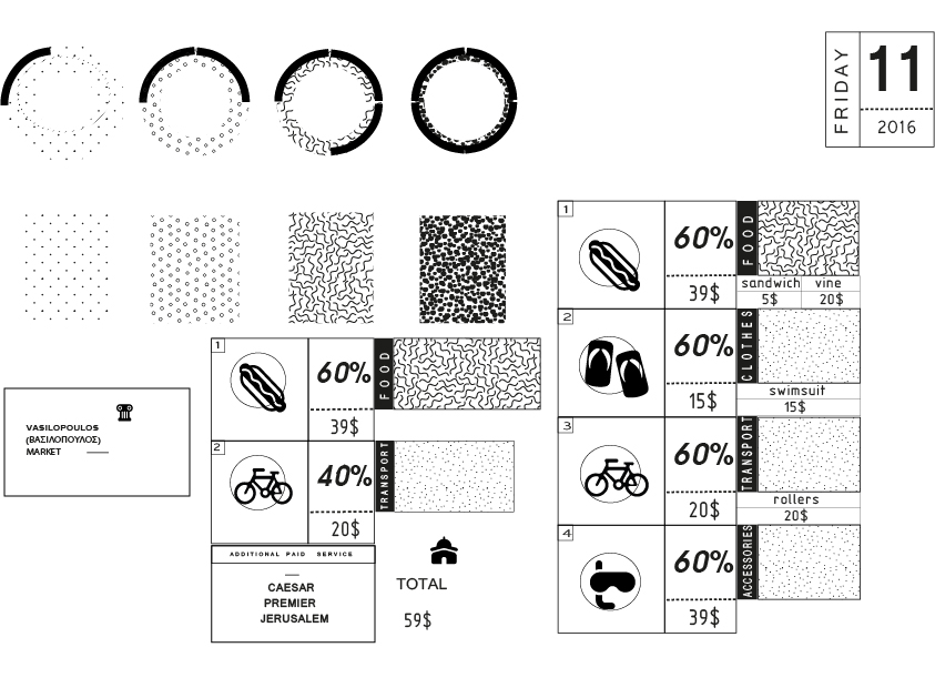
Thank you for buying this tropical island, here is your receipt These receipts based on infographics, conveying the information without reading it. Also I learned something about colors ( in psychological way)- this could make the costumer able to get the information subconsciously. The main point is- not to make receipt the overburden for the reason that this could dissipate the attention. Well, the receipt should be:1 attractive, bright, saturated by color but without using vivid/ acid colors;2 bold, huge to use font which crates the contrast on the sticker and catches the eye. Choosing the shape of sticker I was considering: 1 circle-perfect form but it used everywhere 2 square- look more royal and serious but it's too business-bored. Finally, this seems like the shape called polygon would be perfect, unusual and attractive. Stickers Itself are widely used in marketing to attract customer's attention (for example for sale) and it's a strong strategy- people should exactly understand how much they've spend. As it had already been said, credit card payers couldn't control their expenses. But there is a case which could complicate the situation - spending money abroad. Firstly, the price is represented in foreign currency, so, who'll transit each purchase into another course rate to understand. Secondly, people on vacation pamper themselves with shopping. It's like- I shouldn't care about anything, it's holidays. Well, my aim is to let customer know about the balance. Vacation receipt (unlike first version) shouldn't actually disturb holiday-makers. Even if balance is close to bankruptcy, this couldn't spoil your repose. My system is based on total visualization. The basic element is a circle in the centre, special pattern shows the degree of finance damage. The more full figure, the closer it to bankruptcy.